OTC Work
Green and Red work
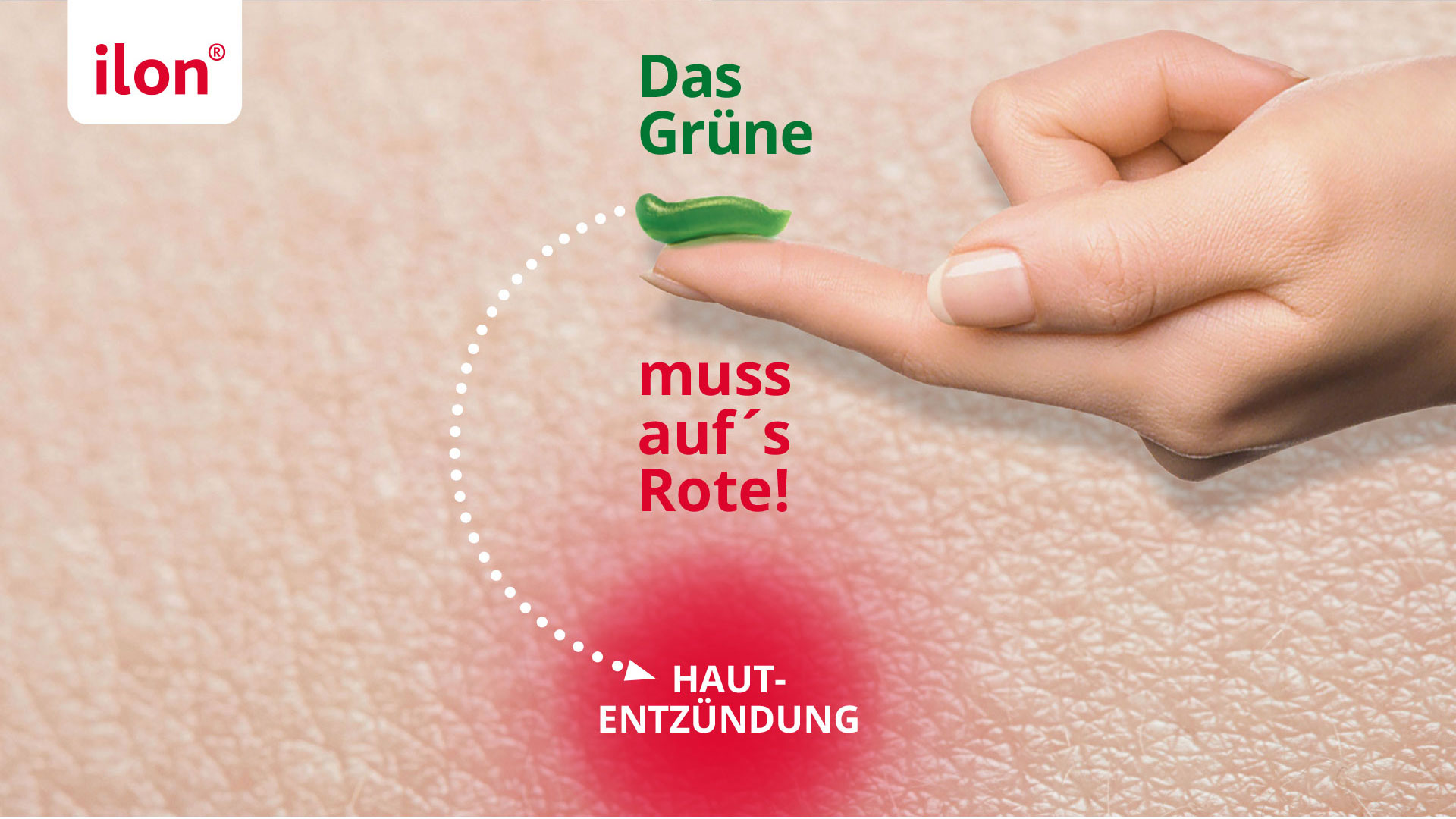
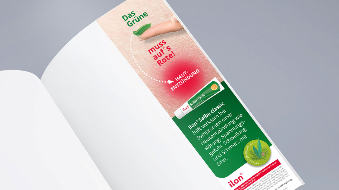
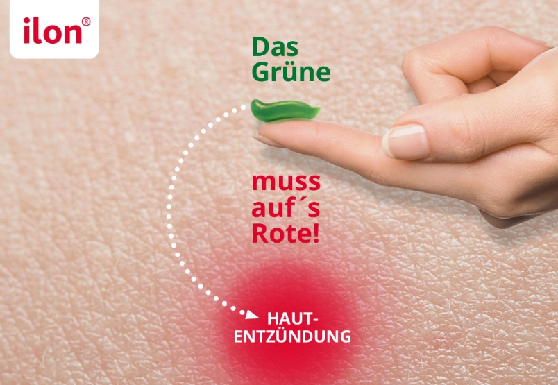
Relaunch of Ilon® Classic Ointment
Challenge and strategic goal
How do you bring a true classic forward in a market that is more characterized by a product form than by a specific indication? The Ilon® Classic Ointment faced competition from so-called black drawing salves, which are used for various skin problems. After thorough analysis, the agency suggested redefining the application area and recommended focusing on skin inflammation. From pimples to the nail area to abscesses, skin inflammation is characterized by a specific appearance: a reddened skin area. Consumers recognize and understand this at a glance. This was where the solution for the campaign lay, as it often does, in the product itself. When taken out of the tube, Ilon® Ointment has a distinctive, fresh green appearance: one immediately recognizes its pure plant nature. Ilon® is applied on skin areas that stand out due to their redness.
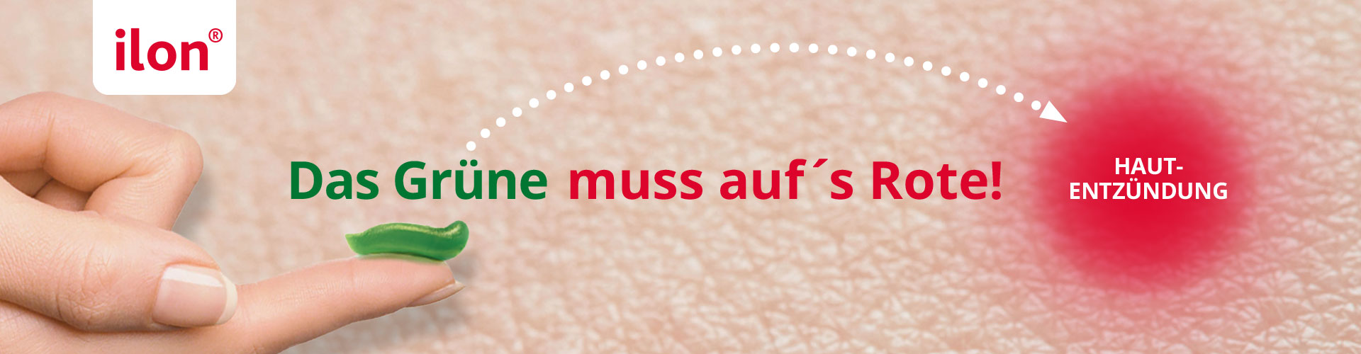
Idea
In other words: Green goes on red, all done! This concise treatment instruction represents the conceptual idea and was visualized just as concisely. A product-as-hero appearance that stands out, differentiates, and quickly communicates, as confirmed by very good test results.